Showing posts with label presentations. Show all posts

Wednesday, 18 May 2011

PowerPoint Slide Design Lesson #3

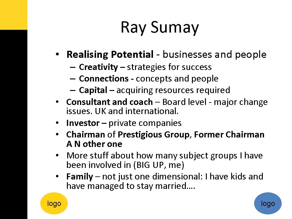
Your slides are not your resume nor your CV. 
Establishing your credibility at a presentation is not about telling them what you have done and how important you are.  Your presentation is not about you at all.

It is all about your audience. 

You will be credible if you
  • connect with your audience
  • demonstrate you understand their needs and their challenges, and 
  • give them practical solutions to their problems.  
Make their life better and you will gain all the credibility and respect that a slide like this simply will not.

this is a genuine example from a recent presentation in the UK by a corporate coach.  I have removed personal details and the corporate logos to maintain their anonymity.

Saturday, 14 May 2011

PowerPoint Slide Design Lesson #2


Your slides are NOT your handouts.

Sure PowerPoint has printing options that let you print 3, 6 or more slides per page of handouts, with or without lines alongside for your learners to make their own notes.

But if your slides contain enough information to be great handouts, then they are lousy slides.

Slides are not written materials - they are not handouts, booklets, or reading matter. They are visual stimulation to add a new communication mode to your oral presentation or narration.

In the opening scenes of a movie, the narrator doesn't describe the scene ("the camera hovers over the roofs of buildings in New York...."). What would be the point?

PowerPoint Slide Design Lesson #1


In a presentations, your slides are NOT your presenters notes - they should not be written to remind you what to say!

If you want to remember what to say...
* learn the story of your presentation
* jot a few reminders on small postcards, just in case you forget
* practise, practise, practise

Keep your slides for powerful images that enhance your narrative and connect with your audience.

Monday, 11 April 2011

Vivid Visuals Bring Words to Life

A vivid visual is one of the most powerful and universal means of communicating with impact. Whether it's sharing a photograph of a special event, or explaining how to assemble your flatpack furniture, nothing beats great a picture (or frustrates as much as a bad one!). But instead of just telling you about them, let me help you experience it for yourself....

Think of an elephant.

No, not one like that.

An especially vivid one: a tiny, purple and silver striped elephant, shiny and crinkly, about 2 inches tall and standing in the palm of your hand right now. She's called Betsy and is trumpeting, pa-pah pa-pah as she stomps around in a circle, which kind of tickles your palm a little bit and makes you smile. She keeps looking at your for reassurance - with her deep black eyes and soft eyelashes, and her big ears billowing. How cute is she? Did the image of her make you smile? Did you (almost) hold your hand out to look at her more closely (I did!).

How real is this elephant to you now? When it comes to your brain, the purple Betsy elephant you have imagined is just as real as if she had really been in your hand - you used the same bits of your brain to imagine her as you do to see her for real.

And will you remember her? You bet!

Imagine then, how a few simple words, specifically designed to create clear and vivid pictures can transform the impact you have when you communicate with other people. A few words can literally bring something alive inside their minds.

So before you start crafting a letter, an email, a presentation, decide on the image you want to create in the minds of your audience. And if you can link a number of images to make a story, or movie, even better.

Saturday, 24 July 2010

Why Should Your Audience Listen to You?

Everytime you present to an audience, you are entering into a bargain with them - they are swapping their time to listen to what you have to say.

What is it that you have to say that they are going to value?
Do you know what the What's In It For Me (WIIFM) factor is?

Why should they listen to you? Are you going to....
* Save them money?
* Save them time?
* Reduce their stress?
* Make them richer?

I was working with a fantastic coach, with a great product and she wanted market her programme to potential clients using some free presentations. Her working title was "Time Management" but it had no WOW, no promise, no WIIFM. By the end of our session, she got crystal clear on the benefit to her audience - and decided to promise that she could save her audience an hour of time every day if they used these techniques.

That is some WIIFM factor!
Would you spend a few hours listening to a presenter who can save you an hour every day of the week?

Think about this when you are designing your presentations - why should your audience listen to you?

Monday, 21 September 2009

The Perfection Trap

How many of us are waiting - until we are ready? until we know it all? until, until.... It doesn't matter what you are waiting for, the time is never right....

You'll never find (read "just happen upon") the perfect moment to ditch your annoying boy/girl friend.
You'll never be totally ready to have children/ leave your job/ quit your job/ start a business.

Waiting for the perfect time is a way to save ourselves from venturing into the unknown (read "scary place"). A way to stay in our comfort zone (read "safe but boring").

But life marches on. I mean honestly - do you really want to get to the end of your life and have carved on your tomb "Here lies XXX. She/ He was waiting to be great".

Here's something to think about... every great presenter, once wasn't.

I know the lure of waiting. Of spending more time researching. Of studying for more qualifications. Of going to more workshops on designing workshops. Of being stuck and not feeling ready.

But ultimately, the fastest and best way to being a great presenter is to start. Now. Start even if you are imperfect. Learn. Develop. Gain experience. Get great.

So what are you waiting for?
Go out there and talk to people, share what you know.

Wednesday, 22 April 2009

How to Send Shivers Down Spines


Earth day 2009 from Zoltan Ladanyi on Vimeo.

This is the most amazing video - Disney knows how to sell us on the importance of the Earth and capture our imagination whilst tugging at our emotions...

Tuesday, 2 December 2008

Editing Your Content: the NEED to know basis

Last week I sat through a number of presentations at a networking event. The event was designed to help women grow their business and one of the topics was marketing.

The presenter had great charisma and personal style - she was passionate and enthuiastic about her topic, which she obviously knew a great deal about. She spoke without notes, which meant she could engage with us directly. She even made her talk interactive by asking questions of the audience to demonstrate how some of us had approached marketing for our own businesses.

But she talked about nearly every aspect of marketing known to man: from blogs, to social networking, local and national media, radio interviews, direct marketing and so on and so on. I knew we were in trouble when I saw her handouts - copies of her bullet point ridden slides (never a good sign).

I left in feeling totally overwhelmed - and I was not alone. Various people made comments about how they needed a break now to take it all in.
I was left with that feeling "I am sure I have learnt something, I am just not sure what".

She was suffering from an inability to focus and edit her ideas down into manageable chunks.
As a result her NEED TO KNOW ideas got lost amongst the rest of what she said.

Whatever the presentation or workshop you are designing, before you start cramming in every thing you have learnt in the last ten, twenty or thirty years, think about this...

What does your audience really NEED TO KNOW?

You might brainstorm lots of ideas, but it is vital that you pick out just one thing that you really feel is the most important thing for your audience to learn. You can add in a few more (depending on the time available), but do make sure that you know what thing or few things you really want your audience to leave with.

Friday, 21 November 2008

Presentation Visuals

This week I have been putting into practice and experimenting with new approaches to presentations and the design of PowerPoint (or Keynote) slides... Whilst I know that you can create workshops and presentations without ever touching a computer (and sometimes they are all the better for it), I know that PowerPoint is embedded within the cultural mindset.

So I feel that if you are going to use slides, they had better be brilliant and enhance what you are saying rather than repeating it (and hence distracting the audience's attention, see yesterday's blog)....

PowerPoint itself does not exactly help you to design great slides - it contains ghastly templates that encourage gruesome colour combinations that are way too busy, with a whole host of bullets or text over the top. Whatever you do, please leave all that alone.

The most important approach is one that says: less is more.
There are three key questions to ask yourself about each visual that you use:

1) Is it simple? Can anyone understand the point you are trying to make easily? That means that large amounts of text or data or points on graph or images are out. Think one key point per slide.

2) Is it beautiful? Does anyone want to look at ugly or cluttered images, clipart or fonts? Why not strive for a beautiful image that people will want to look at?

3) Does it add to what I am saying? The images should be a powerful way of enhancing what you are saying, focussing in on key messages that you want your audience to remember.

Step away from the PowerPoint templates and backgrounds.
Step away from bullet pointed lists.
Step away from clipart.

Embrace full slide photographs.
Create your own simple graphs and diagrams (or even better get a designer to do it).

Thursday, 20 November 2008

Making PowerPoint Powerful

Where are people going wrong when they design slides that result in the muttered phrase "Death by PowerPoint"?

There are two basic mistakes:

Mistake 1 - Designing Slides as Handouts.If you have enough information on your slides for them to work as handouts, then your slides are wrong. Why not simply print out the slides and circulate them, instead of becoming the voice in your audience's heads as they read them?
These slides are Death by text.

Mistake 2 - Designing Slides as an Autocue.The next mistake, is to design your slides to help remind you what to say. Your audience will still read your slides, as you fill in some extra gaps.
These slides are Death by Bullet Point.

Research has proven that it is more difficult to process information if it is coming at your both verbally and in written form at the same time.

So your audience should not be both listening to you and either reading handouts or reading slides. If they are, then they will be doing neither well.

The point of slides is that they provide a strong visual backdrop to complement your words, with the audience focussing on listening to you, your passion and knowledge. They are the stills and you are the narrator.

To avoid these mistakes, you must design your slides, your prompts and your handouts as separate items. You can use PowerPoint for all three, but they are likely to be separate files not the same one.

Next time you are designing a presentation, see if you can think of the slides as a visually exciting film, which you are narrating.

Monday, 3 November 2008

The Power of Passion

I watched an incredible speech over the weekend, by a 12 year old girl.
She spoke with simple phrases to an audience at the United Nations.

This would daunt even the most extrovert presenters, yet she spoke calmly without a hint of nerves.
What is most extraordinary about her short 6 minutes is the strength of her passion.

She talks about flighting for her future, and how it is not like losing an election or a few points on the stock market. She pleas for us to stock breaking things we cannot fix (like a desert that was once a forest). She asks us why we are so greedy, why we cannot share. Simple questions that perhaps we forget to ask anymore.

Watch this and learn how to write a great speech that could also silence the world.

Watch it by following this link:
http://uk.youtube.com/watch?v=TQmz6Rbpnu0

The video is rightly entitled: The Girl Who Silenced The World.