Showing posts with label PowerPoint. Show all posts

Wednesday, 25 May 2011

PowerPoint Slide Design Lesson #4


Your slides are not an all-you-can-eat buffet!

This is a replica of a genuine slide from a recent talk I attended.  The knowledge of the presenter was fantastic, the delivery okay - the presenter closed his eyes when he faced the audience - but the slides....

Each slide was a visual feast -in the style of an "all you can cram onto your plate" buffet, and our eyes definitely overate!

There were too many clashing elements: large uneven boxes with harsh black lines, a mishmash of fonts and tiny, irrelevant images.  And just how many synonyms do you need for Scholarship and Wisdom?


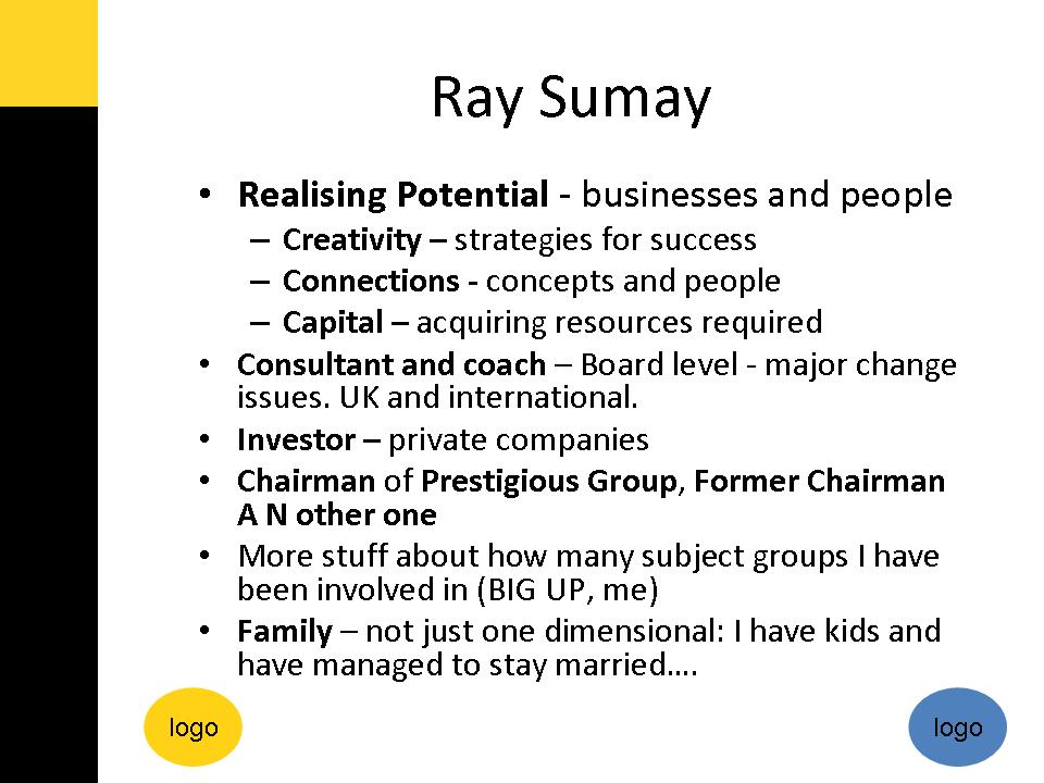
To my mind, all the slide needed to have on it was this.


Then you narrate around the elements, guiding your audience through the cycle.  The presenter clearly knew his stuff, so why he put so much on the slides, I may never know.

Wednesday, 18 May 2011

PowerPoint Slide Design Lesson #3

Your slides are not your resume nor your CV. 
Establishing your credibility at a presentation is not about telling them what you have done and how important you are.  Your presentation is not about you at all.

It is all about your audience

You will be credible if you
  • connect with your audience
  • demonstrate you understand their needs and their challenges, and 
  • give them practical solutions to their problems.  
Make their life better and you will gain all the credibility and respect that a slide like this simply will not.

this is a genuine example from a recent presentation in the UK by a corporate coach.  I have removed personal details and the corporate logos to maintain their anonymity.

Saturday, 14 May 2011

PowerPoint Slide Design Lesson #2


Your slides are NOT your handouts.

Sure PowerPoint has printing options that let you print 3, 6 or more slides per page of handouts, with or without lines alongside for your learners to make their own notes.

But if your slides contain enough information to be great handouts, then they are lousy slides.

Slides are not written materials - they are not handouts, booklets, or reading matter. They are visual stimulation to add a new communication mode to your oral presentation or narration.

In the opening scenes of a movie, the narrator doesn't describe the scene ("the camera hovers over the roofs of buildings in New York...."). What would be the point?

PowerPoint Slide Design Lesson #1


In a presentations, your slides are NOT your presenters notes - they should not be written to remind you what to say!

If you want to remember what to say...
* learn the story of your presentation
* jot a few reminders on small postcards, just in case you forget
* practise, practise, practise

Keep your slides for powerful images that enhance your narrative and connect with your audience.

Monday, 11 April 2011

Vivid Visuals Bring Words to Life

A vivid visual is one of the most powerful and universal means of communicating with impact. Whether it's sharing a photograph of a special event, or explaining how to assemble your flatpack furniture, nothing beats great a picture (or frustrates as much as a bad one!). But instead of just telling you about them, let me help you experience it for yourself....

Think of an elephant.

No, not one like that.

An especially vivid one: a tiny, purple and silver striped elephant, shiny and crinkly, about 2 inches tall and standing in the palm of your hand right now. She's called Betsy and is trumpeting, pa-pah pa-pah as she stomps around in a circle, which kind of tickles your palm a little bit and makes you smile. She keeps looking at your for reassurance - with her deep black eyes and soft eyelashes, and her big ears billowing. How cute is she? Did the image of her make you smile? Did you (almost) hold your hand out to look at her more closely (I did!).

How real is this elephant to you now? When it comes to your brain, the purple Betsy elephant you have imagined is just as real as if she had really been in your hand - you used the same bits of your brain to imagine her as you do to see her for real.

And will you remember her? You bet!

Imagine then, how a few simple words, specifically designed to create clear and vivid pictures can transform the impact you have when you communicate with other people. A few words can literally bring something alive inside their minds.

So before you start crafting a letter, an email, a presentation, decide on the image you want to create in the minds of your audience. And if you can link a number of images to make a story, or movie, even better.

Friday, 17 December 2010

Dear Santa..... My Christmas List for 2010

This year I have been generally good, with a few episodes of overindulgence all to report on the bad girl front. Whilst I know this is the season for giving, could you do some taking instead? If you take a few features in PowerPoint away, you will be giving back thousands, if not millions of hours of life to those who might otherwise suffer from Death by PowerPoint next year. I know they are big asks, but if anyone can do this, you can.

Please, please delete the Word Art function - it's about as clever as writing your name using an etch-a-sketch.

Ditto clipart - those bean men might have seemed clever in the days when an electronic typewriter was the height of fashion, but honestly, have you seen technology nowadays? Would the iPad have clipart?

Please delete the function that lets people print out their PowerPoint slides as handouts - it only panders to lazy presenters and bores us all with prose-ridden slides (when did the "visual" part of a presentation become a page of a book?)

Please also delete all the hideous PowerPoint design templates - which I think is pretty much all of them - a blank white screen is preferable in many cases, especially that one with the annoying ball that moves across the screen for every single bleeding slide.

Please also delete the following functions:
* adding sound effects - unless operated by a skilled sound effects guru
* animating words so that they spiral in front of our eyes - unless part of a Derren Brown hypnosis
* and finally bullet points - nuff said

Thank you very much in anticipation of a much more inspiring year of Presentations.
Yours humbly
Sparkie

I am sure I will think of a few more, but these would make me very happy in 2011.

Wednesday, 14 July 2010

Selecting Images that Speak to Your Audience

This week I've been creating a very 'Zen' style presentation on the topic of Parent Advocacy.

I love 'Zen' design and my slides were looking good.....
  • Simple.

  • Stylish.

  • Strong beautiful images.

  • Powerful phrases.

I was feeling pretty chuffed with myself until I noticed one thing.....

I had tin cans connected with string for communication.
A power of books for information and advice
A megaphone for parent voice.

But not as single picture of either a parent or a child.

This entire presentation is based on reminding parents how important they are, and how we want to give them a new voice in our region. How could I have missed that?

A few minutes later and the revised version is much stronger - showing images we have taken at our events, and people (young and old) my audience will relate to.

Now, all the powerful phrases such as "Giving Parents a Voice" are next to images of a parent holding a microphone.

I put the audience in the picture, so to speak!

Wednesday, 22 July 2009

Beautiful Simple Images combined with Powerful Words

This is a great example of a mid-week pick-me-up.
What's not to like?

* Beautiful, simple, high quality photographs of gorgeous scenery that echo and enhance the phrases
* Touching, inspirational words that really connect with all our lives - who hasn't ever felt like quitting and needed support to keep going?

In just two minutes, without rushing, this presentation speaks to us personally (notice the prevalence of the word "you" in the poem).

Please post your comments below - what would you improve?